Most inquiry and quote forms don’t fail because you lack traffic. They fail because you have added too much friction. This guide will show you how to build high-converting forms short, clear, mobile-first forms that users finish.
Why forms = revenue (not just “leads”)
Your form is the last mile of your sales funnel. If it’s confusing or nosy, you’re paying for clicks that never turn into conversations. Fix the form and you’ll lift conversions across every marketing channel — SEO, ads, social media, and email.
The anatomy of high-converting forms
What does a high-converting inquiry and quote form look like? Something like this:
- Headline: “Get Your Custom Quote in 60 Seconds.”
- Inline trust: “2,100+ happy clients!” and add a short line about your privacy practices.
- Minimal fields: Don’t ask for anything you don’t need! Name, email, and phone are enough for most businesses.
- Clear primary CTA: Your button should say something like “Get My Quote” instead of simply “Submit.”
- Safety net: Give them secondary paths to reach out like a click-to-call, chat, or book a call link.
Ask less, convert more
Instead of asking for more information that you don’t necessarily need to close the deal adds more of that friction we talked about earlier. Here’s the field strategy we’re going for with high-converting forms:
- Keep Step 1 to 3-4 required fields max
- Move the “nice-to-have fields (like budget, timeline, details) to Step 2 or, better yet, after the submission via an email
- Use autofill features or other smart selects and defaults to reduce typing
- If possible/applicable, add conditional logic so most users see fewer fields
A good starting point for your form would contain these four fields:
- Full name
- Phone
- Service needed
Copy that calms
You can also reduce friction by being intentional with your copy:
- Replace “Submit” with an action and benefit: “See My Price” or “Book My Spot.”
- Add short helper text under fields such as, “We’ll only call if we have questions” underneath the phone number field.
- Reduce fear with a sub-CTA: “No spam. Unsubscribe at anytime.”
Errors and validation that doesn’t punish users
You want your form to catch mistakes early and clearly but you want to do so without making people feel scolded or forcing them to retype their life story. Here’s how to accomplish that:
- Validate a field after they leave it. Don’t have it put up red errors while they’re typing.
- After submission, show a compact summary at the top and
- Live validation is OK for password strength meters or pricing calculators. Otherwise, it’s just noisy.
- NEVER wipe inputs. Keep everything the user typed.
- If you auto-format (e.g., phone number), do it gently and allow variations.
- Don’t make them hunt for errors. Have an inline message directly under the field, give the field a red outline and icon. Have the first error link jump to the incorrect field.
- Be human in your copy. Instead of “Invalid input” say “That email looks off. Try name@company.com.”
- On multi-step forms, validate step-by-step and enable autosave in session so a reload doesn’t nuke their process.
Mobile-first form UX
You probably know this, but most people are visiting your website from their phone. So, to make sure you have high-converting forms, optimize them for mobile:
- Fewer fields with bigger tap targets
- Your form brings up the correct keyboards (telephone vs. email)
- Avoid long dropdowns
- Form has a sticky CTA on mobile so the button is always reachable
Accessibility = more conversions
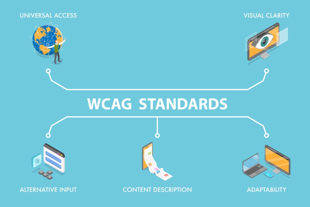
Accessibility isn’t just the right thing to do. It is a revenue unlock. When more people can use your site easily on any device with any ability, more of them become leads. High-converting forms that are accessible have:
- Visible labels on every input, not just placeholders.
- Clear focus states and sufficient color contrast.
- ARIA only when native HTML can’t do the job
- Fully keyboard-navigable functionality
Kill spam without killing conversions
We get it. You don’t want an inbox full of form fills only to find out they’re spam. To accomplish this:
- Have a honeypot field with time to complete checks
- Use an invisible reCAPTCHA and only challenge suspicious submits
- Rate-limit rapid repeats
Final word on high-converting forms
So, now you know the formula: Fewer, clearer fields + calm copy + mobile-first design + accessibility = high-converting forms which bring in more leads. Most businesses will see a noticeable lift from these fixes alone.
Still questioning whether it’s your form causing users to fall out of your sales funnel? Book a FREE, no-decision meeting with 2oddballs Creative. We can review your form and website and let you know! Just drop us a line on our form down below.


